
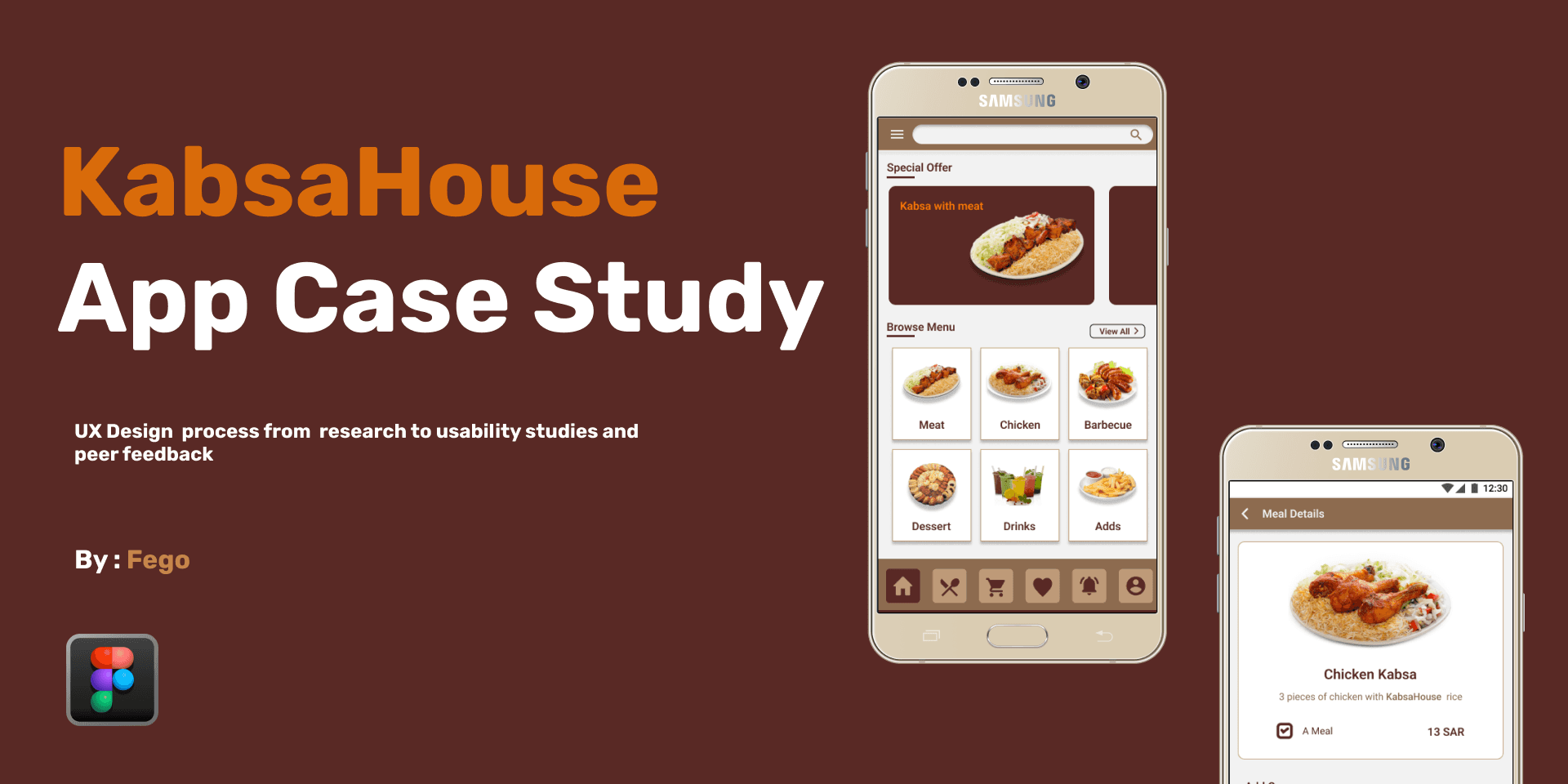
KabsaHouse UX Case Study
User research: pain points
Time:
Working adults are too busy to spend time on meal prep.
Accessibility:
Platforms for ordering food are not equipped with assistive technologies.
IA:
Text-heavy menus in apps are often difficult to read and order from.
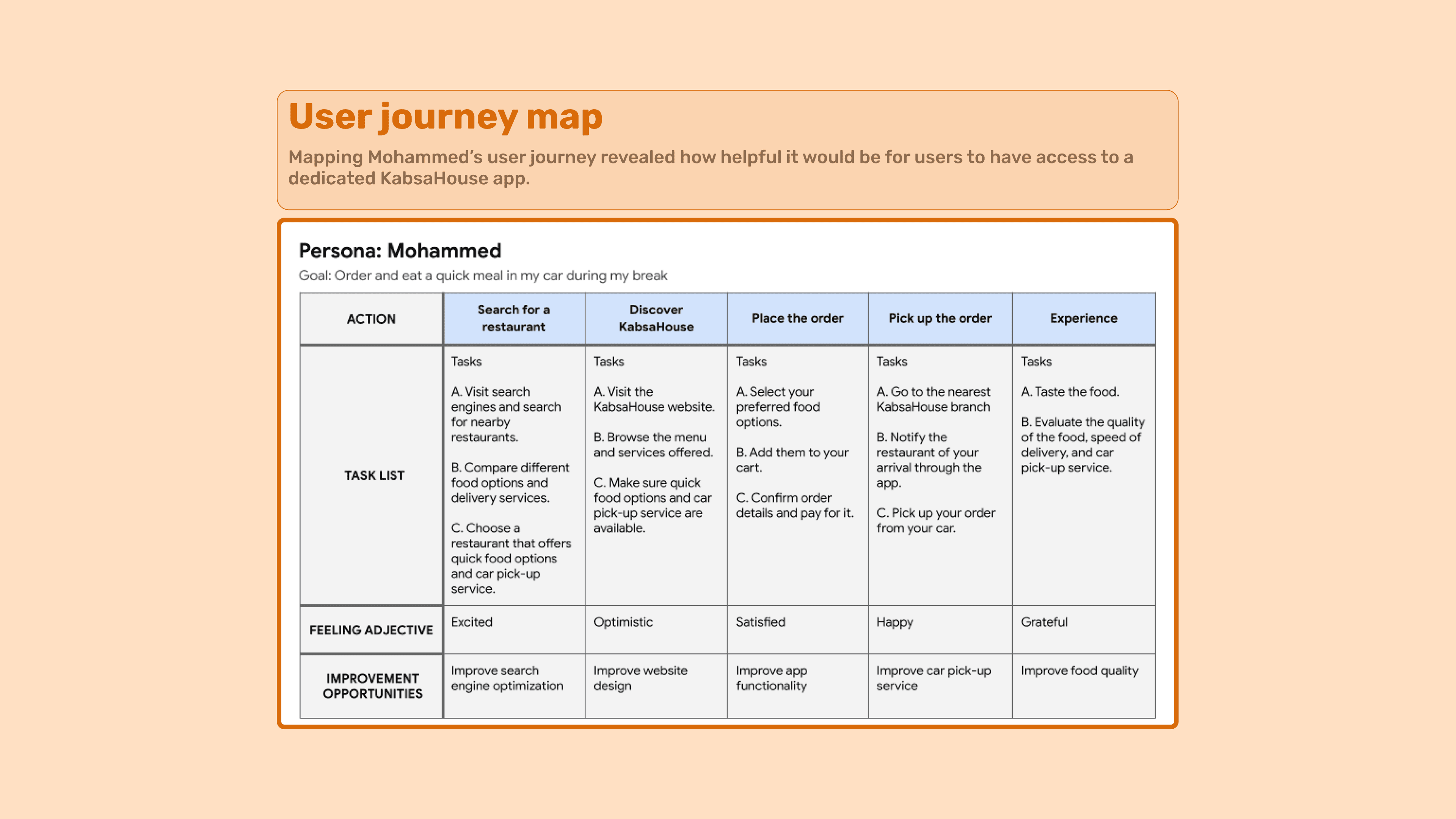
User Persona:
Mohammed is a doctor who needs a restaurant that offers healthy options and fast delivery, because they have no time to cook dinner for themself.

User journey map:
Mapping Mohammed’s user journey revealed how helpful it would be for users to have access to a dedicated KabsaHouse app.
Wireframes :


Visual Design:
The next plan of action was to create color palettes and typography that would help communicate the brand’s identity and also give the product an exciting feel.


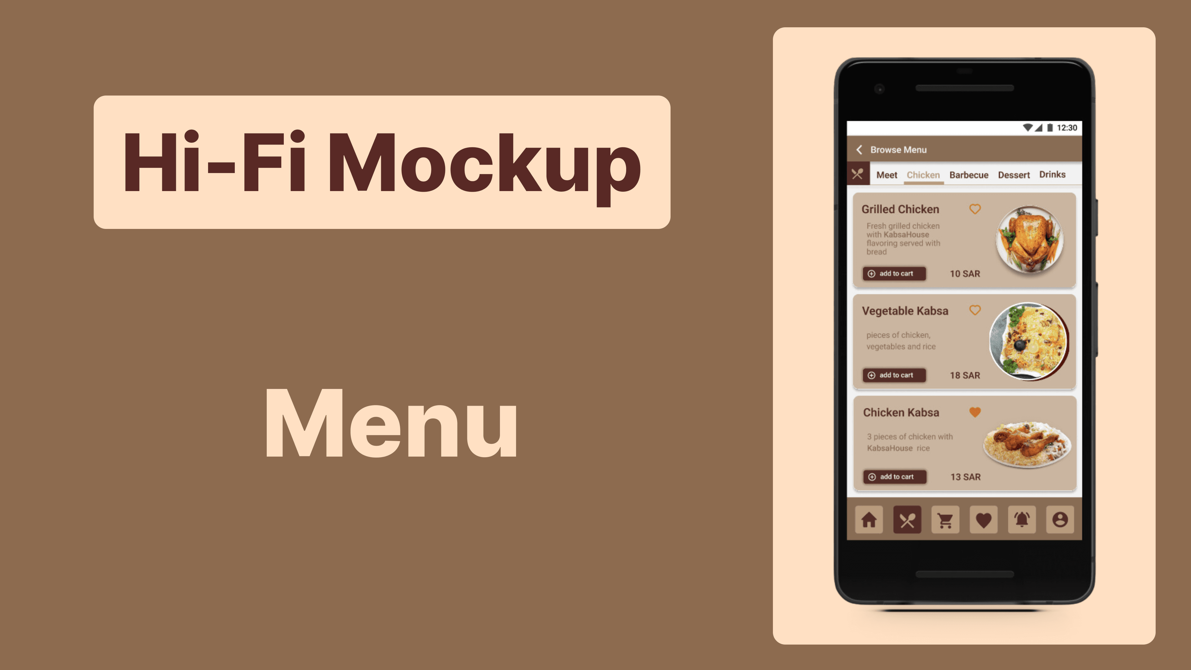

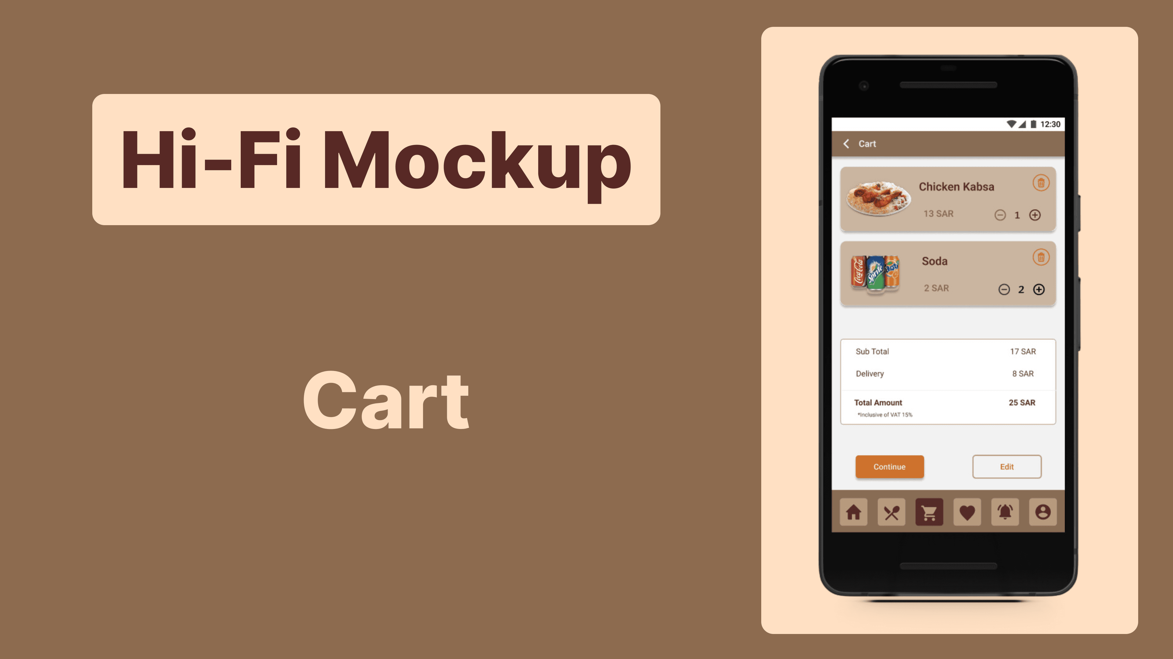
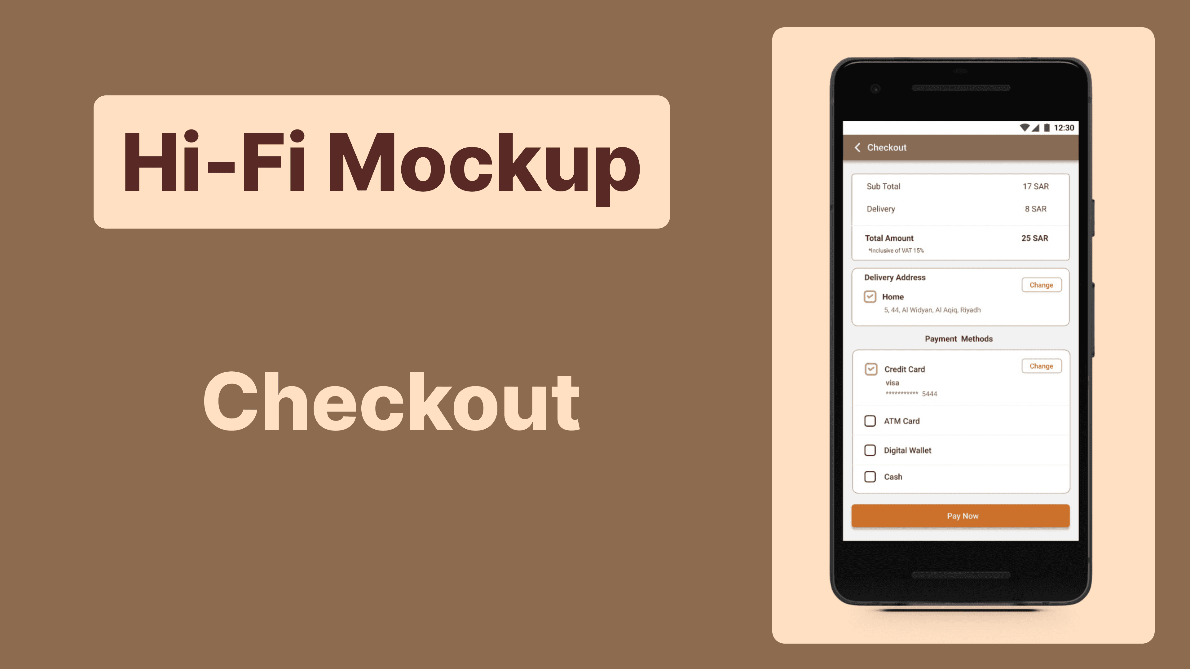

Prototype :
The final high-fidelity prototype presented cleaner user flows for building a meal and checkout. It also met user needs for a pickup or delivery option as well as more customization.
click Here to View Prototype.
Usability study: findings
I conducted two rounds of usability studies. Findings from the first study helped guide the designs from wireframes to mockups. The second study used a high-fidelity prototype and revealed what aspects of the mockups needed refining
Round 1 findings :
Users want to order Meal quickly.
Users want more customization options.
Users want a delivery option.
Round 2 findings
The checkout process has too many unnecessary steps.
The process of navigating within the application is difficult and not smooth.
Accessibility considerations:
Provided access to users who are vision impaired through adding alt text to images for screen readers.
Used icons to help make navigation easier.
Used detailed imagery for Meal and toppings to help all users better understand the designs.
Takeaways:
Impact:
he app makes users feel like KabsaHouse really thinks about how to meet their needs.
One quote from peer feedback:
“The app made it so easy and fun to build my own meal! I would definitely use this app as a go-to for a delicious, fast, and even healthy meal.”
What I Learned:
While designing the KabsaHouse app, I learned that the first ideas for the app are only the beginning of the process. Usability studies and peer feedback influenced each iteration of the app’s designs.
Next Setup:
Conduct another round of usability studies to validate whether the pain points users experienced have been effectively addressed.
Conduct more user research to determine any new areas of need.
Let’s connect!
Thank you for your time reviewing my work on the KabsaHouse app! If you’d like those more or get in touch, my contact information is provided below.
Email: Fageir.khairy@gmail.com
Website: Fego.framer.website
Client :
KabsaHouse
Service type :
UI/UX Design
Duration :
2 Month
My Role :
UI/UX Designer
Tool :
Figma - Google Workspace